Kristian Segelken | Creative Director
Trends come and go but good branding is forever. You’ve gone through the hard work of figuring out what your brand should look like, but how does it align with current visual trends?
Here’s a brief selection of the most eye-catching trends so far this year. Which ones fit your brand? Are there some that you think will stick around longer than others? Are there any you think you can incorporate into your online presence? Check them out and let us know!
Real people, not models.
With so many more brands online than there were just a few years ago, some people have started to look past the perfectly-styled photos in search for something more relatable and natural. Your followers want to see real people and not just stock actors or models. This idea, sometimes referred to as “produced realism” embraces the perfectly-imperfect nature of people, situations, and products to show a more honest version of a brand.
Most people don’t own studio lights, backdrops, or fancy cameras. Most people are taking pictures around town, wherever the light is good and using a cell phone or basic DSLR camera, so experiment with trying to fit that appearance. Photographer Cem Guenes explained it well: “We need to shift the brand conversation. Even if it’s commercial, it has to look like it’s not staged. It has to be about real and authentic people, so don’t be afraid to tell the truth in advertising.”
https://www.instagram.com/p/CByJWI6gk_9/?utm_source=ig_web_copy_link
https://www.instagram.com/p/B9wwzsvFOrY/?utm_source=ig_web_copy_link
Bright Colors & Simple Design
If you’ve seen Pantone’s Color of the Year, you might think the palette for 2020 is traditional, maybe even a little boring, but that’s not the case. So far 2020 has given us bright, pastel-ish colors that demand your attention and (ideally) stop you from scrolling for just a few extra seconds. Deep Sky Blue or #00BFFF for you hex fans out there has been a stand-out example so far. (And it looks like this!)
Consider using your brand colors or the colors from your packaging to create one cohesive color story. Pierre’s Ice Cream is a great example of keeping it simple with bright colors. This theme stretches across their social media posts and advertisements to provide a fun and consistent look.
https://www.instagram.com/p/B-FF8evnYY4/?utm_source=ig_web_copy_link
https://www.instagram.com/p/B_DKXf5pYFK/?utm_source=ig_web_copy_link
Miami Art Deco
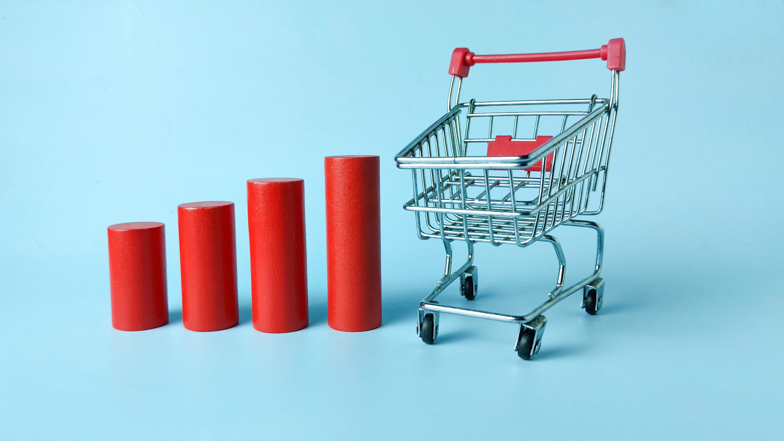
This one might seem like an unusual source of inspiration, but the clean, geometric shapes and bright colors of Miami’s Art Deco architecture have made a huge resurgence in photography and 3D design recently – just take a look at the cover photo for this article! It’s simplicity and versatility makes it the perfect style to highlight a product (especially one with aesthetically pleasing packaging). Check out these retro examples for yourself!
https://www.instagram.com/p/CB5_bDhgjCq/?utm_source=ig_web_copy_link
https://www.instagram.com/p/B-cbbcYgS1j/?utm_source=ig_web_copy_link
There’s more to come…
These are just a few examples of what we’ve seen so far this year and we can’t wait to find out what other visual trends are on the way. Remember, the Cool Nerds team is here to help you create amazing content for your social media campaigns as well as provide insights into the content that performs best. Contact us today!


