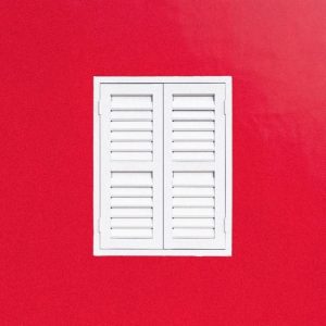
Minimalism emerged during the early 1960s in the USA as a rejection of abstract expressionism art. At the time, artists believed in stripping emotion from the artwork and any metaphors or symbolism. Aesthetically, minimalist art is a literal presentation that gives a purified form of beauty, representing truth, order, simplicity, and harmony. Currently called neo-minimalism, this movement is still ongoing, primarily in graphic design. Because attention spans are shorter and people are savvier, the motto “less is more” creates an atmosphere where viewers have room to make rational decisions.
Logically, a simple design might appear to be faster and easier to achieve. Au contraire because every element is essential and strategically placed to transmit a message without underlying meanings. Understanding and knowing how to utilize minimalism as a graphic designer properly is a helpful skill to make your work stand out. Minimalism, just like every art movement, has a set of practical approaches. If you want to try out this style in your next project, check the following essential tips for mastering this movement.
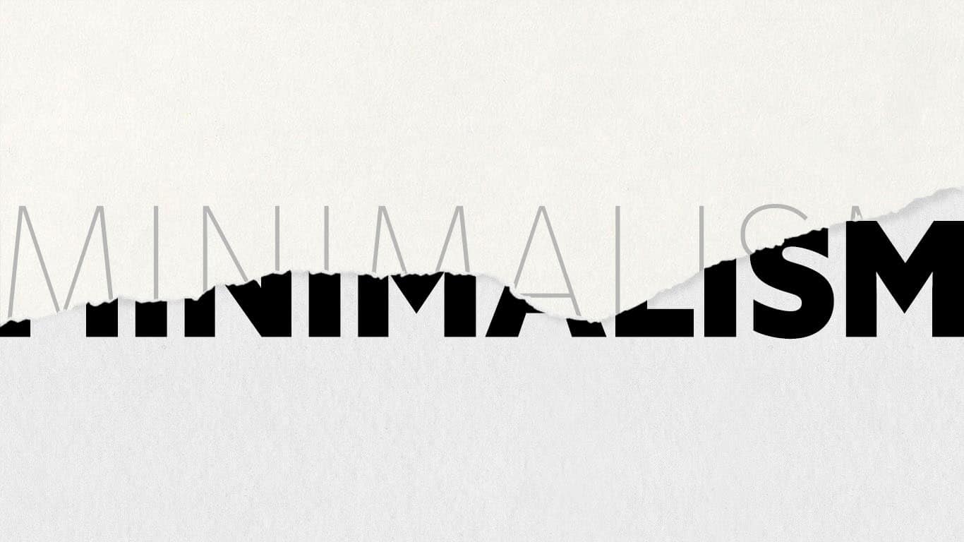
Less Is More But Meaningful
Intricate designs might give the illusion of being smarter or more sophisticated. In reality, they are suffocating, less memorable, and ultimately less persuasive. Working with fundamental components produces a higher effect on user’s readability and usability. By adopting a clean and simple design, you will increase the viewer’s attention to the main message conveyed.

Omit Needless Things
Every design has details that serve two purposes: functionality and beautification. Unfortunately, when trying to make an aesthetically pleasing design, a viewer might feel bombarded with unnecessary elements. Working with limited layouts and color palettes will generate a clearer and more deliberate design. Ultimately, one can even incorporate essential elements, creatively, and make an extraordinary piece.
Keep the Bare Essentials
Steer clear of extraneous decorations. Before adding an element, ask yourself: Does it enhances the design and serves a purpose? If the answer is no, then you should cut it. A good strategy for making sure your design is truly minimalist, strip it from components until it stops working. The point right before that is when you’ve achieved the most minimal design possible.

White Space is Vital
Empty space is not your enemy but your best friend. By taking advantage of this, you can control what you want your viewer to focus on while making them feel comfortable and less claustrophobic.
Use Grids to Maintain Order
One of the challenges of utilizing white space is the noticeability of a particular item not aligned. For this reason, it’s essential to organize your design into a grid layout. This type of arrangement will make sure everything is visually harmonized and balanced. Using a grid alignment allows you to be as creative as possible while making sure all vital components are arranged in a pattern satisfying to the human eyes.

Every Detail Counts
Think of the feeling you want viewers to have when engaging with your design. Once you have that defined, include selective details that transmit those reactions. Since minimalist design has few elements, it’s important to note that what you choose to include is vital.
Color Minimally
Aesthetically, colors with the highest contrast work better together. When choosing a color, be strategic, and keep the amount to a minimum. Black, white, and grey are the most dominant colors with the highest contrast. They also allow for a single color to have a more imposing impact on the overall design. Pick a color that complements the message and mood you want to convey.